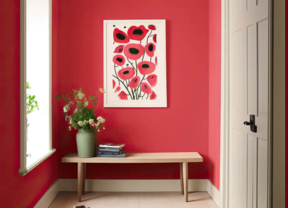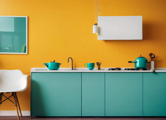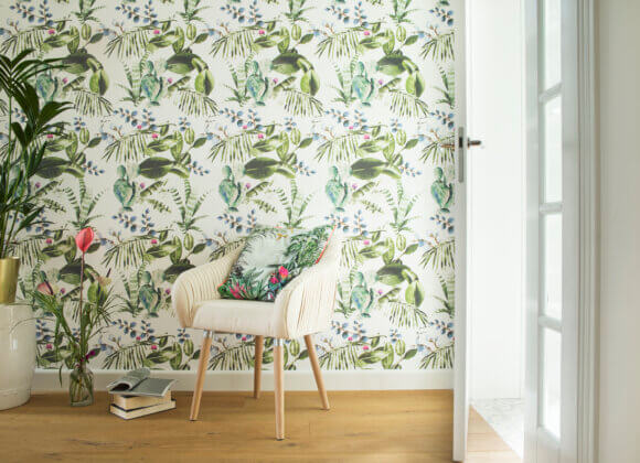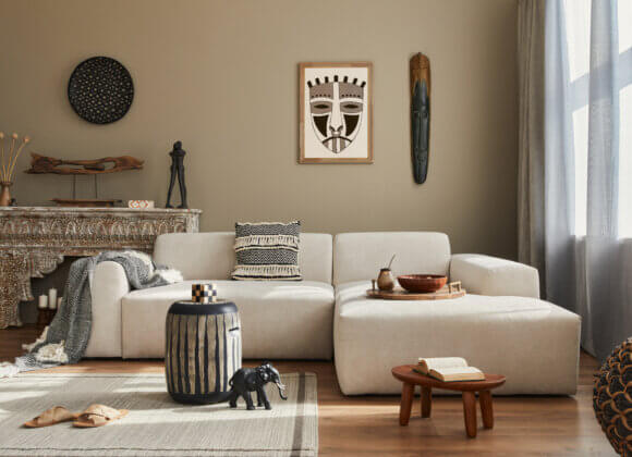

Warm off-white instead of cool gray, neo-neutrals, terracotta, and cool blue: This year, walls are becoming softer, cozier, and more personalized. Interior designer Stefanie Winter explains the 2026 wall color trends, how to combine them properly—and why the effect a room creates is more important than any passing trend.
What color makes a room cozy? Does a small room really have to be painted in a light color? And what exactly is behind “neo-neutrals” or “cool blue”? Stefanie Winter, an interior designer from Graz and founder of “S.TEFANIE,” explores the impact of colors, materials, and light in a room every day. In this interview, she reveals which wall colors are currently playing a key role, which combinations work particularly well—and why, when choosing colors, she focuses less on trends and more on the people who live in a space.
What are the wall color trends for 2026—and which shades are falling out of favor?
Currently, colors are once again becoming softer, more nuanced, and, above all, more inviting. We’re seeing many muted, natural tones: warm off-whites, sand, taupe, olive, sage, ochre, and earthy terracotta shades, as well as powdery shades of blue and green.
For me, the very cool, uniform gray that we’ve seen everywhere for many years is losing its appeal. Of course, gray isn’t going away, but classic concrete gray or “Millennial Gray” paired with pure white is starting to look increasingly cold and generic. Instead, more complex colors with warm, green, or earthy undertones are taking their place.
Which color best captures the current trend in home decor?
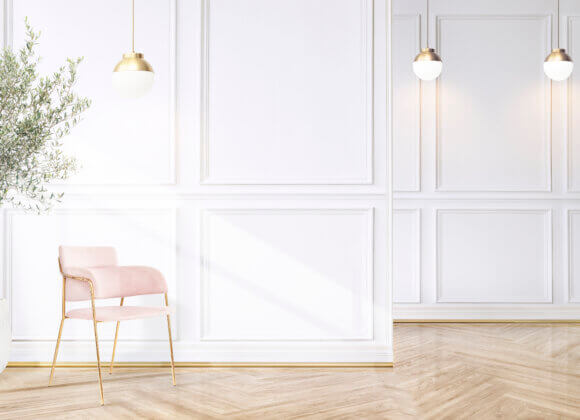
Pantone has selected PANTONE 11-4201 Cloud Dancer as the Color of the Year for 2026—a very soft, airy white. Pantone describes it as a color that evokes calm, clarity, and a conscious new beginning in an increasingly noisy and overstimulated world.
At first glance, you might say: White? Really? But Cloud Dancer isn’t a harsh, clinical white—it’s a calm foundation that gives space to other colors, materials, and personal touches.
We’re currently experiencing a strong longing for retreat, clarity, and relief. Our daily lives and our minds are already full—so our living spaces don’t need to be constantly “noisy” as well. For me, that’s exactly why Cloud Dancer fits so well with the times we live in: Home is once again becoming a place of tranquility.
What are “neo-neutrals,” and which colors fall into this category?
To me, neo-neutrals are the more exciting generation of neutral colors. Not just white, beige, or gray, but muted colors with subtle undertones: sand, taupe, greige, warm off-white, olive gray, sage, buttercream, vanilla, or very powdery shades of pink and blue. At first glance, they appear neutral, but upon closer inspection, you discover the color. This makes rooms feel calm but not sterile—and that’s exactly what sets neo-neutrals apart from classic, monotonous gray.
How can you incorporate neo-neutrals into your home without making the rooms seem too subdued or boring?
On materials, textures, and contrasts. When the wall, sofa, rug, and curtains are all nearly the same shade of beige and their surfaces are similar, a room can quickly feel flat.
That’s why I would create different layers: for example, a sand-colored wall, darker wood, a wool rug, linen, natural stone, and ceramics—complemented by a deliberate darker or colorful accent.
A room doesn’t necessarily need a lot of colors. It needs depth. Especially with minimalist color schemes, texture, light, and the quality of materials become all the more important. To me, a sense of quality doesn’t come from having as many things as possible, but from making well-considered choices.
Which wall color works especially well in the living room? Are there colors that are better suited for large surfaces than others?
For large spaces, I love colors that don’t immediately dominate the room. Warm off-whites, sand, taupe, muted olive, or a very soft blue-green can work wonderfully in the living room. They create a cozy atmosphere without making you tired of them after three months.
The term “Cool Blue” also comes up often—how does this shade look in an interior? For which rooms and interior design styles is it particularly well-suited?
Cool Blue is a light, cool, slightly powdery blue that will become increasingly prevalent in 2026. It falls somewhere between sky blue and ice blue and a very light, muted blue, and can almost be used as a neutral color.
We often associate blue with calm, spaciousness, and clarity. That’s why Cool Blue works beautifully in bedrooms, bathrooms, or quiet living areas.
The key is in the combination: paired with warm wood, cognac, cream, linen, wool, or warm brown, the shade immediately takes on a cozier feel. With lots of cool gray, chrome, and cold white, however, it can quickly come across as frosty. I love this exact contrast: cool color, warm materials.
And how do you pair terracotta as a wall color with furniture, wood types, and textiles?
Terracotta instantly brings warmth and a sense of grounding to a room and therefore harmonizes beautifully with natural materials. I really love combinations with oak, walnut, darker woods, natural stone, linen, wool, and ceramics.
In terms of color, cream, sand, off-white, olive, sage, and, in some cases, a muted blue pair very well with it.
I’d be cautious with very orange-toned woods and additional strong red or orange hues. Otherwise, warmth can quickly turn into excess. My rule of thumb is: If the wall already makes a strong statement, not all the other elements need to make a loud statement as well.
What are the 2026 wall color trends for the bedroom?
In the bedroom, I’d be especially cautious about following trends. It’s not about what looks spectacular in a photo, but about allowing our minds to unwind.
I really like muted shades of blue, green, sand, and taupe, or warm, soft off-whites. A darker, enveloping shade can also work wonderfully if the space and your personality are a good fit.
Darkness in the bedroom isn’t necessarily a bad thing. A dark room can feel incredibly cozy. Color doesn’t necessarily have to create a sense of space here—it can also envelop us. Because, to me, coziness isn’t just a matter of decor; it’s about emotional security.
Does the size or brightness of a room play a role in choosing a wall color?
Absolutely—but not according to the old rule “small room = white.” Of course, light colors reflect more light. But a small, dark room won’t suddenly become sunny just because you paint it white. On the contrary: the wrong shade of white can make it look gray and lifeless. Sometimes it’s much more interesting to embrace the existing atmosphere and deliberately create a sense of coziness with a rich, warm tone.
That’s why I always ask myself: Where does the light come from? How does it change throughout the day? Which direction does the room face? What artificial light sources are there? Color never exists without light.
Will entire walls really need to be painted in solid colors by 2026, or will accent walls and color blocking still be in style?
No, of course not every wall has to be painted. But the classic single accent wall—three white walls and one bold wall at the back—isn’t automatically the most exciting solution for me.
I find deliberately placed areas of color, architectural zoning, or color blocking more interesting: for example, visually defining a dining area, marking a reading zone, or extending color across the wall and ceiling.
So color can structure spaces—not just decorate them. That, to me, is the big difference.
To what extent do the flooring, furniture, and existing materials influence the choice of the right wall color?
Extreme. A wall color is never perceived in isolation. Hardwood floors, stone, sofas, curtains, kitchen cabinet fronts, and even metal surfaces all alter its effect.
That’s why I don’t choose a wall color based on a small color swatch. If key pieces of furniture, flooring, or materials are already in place, I start with those. For a completely new concept, however, I develop a cohesive world of colors and materials.
Whether the sofa or the wall color was chosen first isn’t ultimately decisive. What’s important is that, in the end, everything tells the same story.
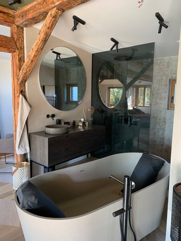
Which color combinations do you think we’ll see most often in 2026?
I see a lot of tone-on-tone schemes and combinations that are more subtle than “one color plus white.” For example, I find the combination of sand with olive and dark wood, terracotta with cream and sage, Cool Blue with chocolate brown and warm white, or taupe with powdery rosé and walnut particularly intriguing.
Cloud Dancer, too, works less as the “white end of a color palette” and more as a calm counterpart to other muted tones and as a base that lets other colors shine.
Will warm or cool shades be more in demand in 2026?
For me, the exciting trend for 2026 lies right between warm and cool. While we’re seeing a lot of warm, natural tones, cooler shades are also making an appearance, such as Cool Blue, muted green, and smoky violet. Instead of designing entire rooms in strictly warm or cool tones, color temperatures are blended: cool blue with warm walnut, olive with cream and stone, or terracotta with powdery blue. These contrasts create visual interest and give rooms a more personalized feel.
What are the most common mistakes people make when choosing wall paint?
For me, the biggest mistake is choosing a color without considering the room. A shade that looks beautiful in the store can look completely different at home.
Light, the direction the room faces, the floor, the furniture, and the size of the space can drastically change how a color appears. The latter factor, in particular, is often underestimated: a 10-centimeter swatch looks completely different from an entire wall.
So here’s my advice: Test colors over a large area and look at them in the morning, at noon, and in the evening—and be sure to check them under artificial light as well. And please don’t order five different shades of white and assume that white is white. It definitely isn’t.
What advice do you give to people who want to add color to their homes but are hesitant to use bold wall colors?
Don’t start with “courage”—start with emotion. First, ask yourself: How do I want to feel in this room? Calmer? Warmer? More secure? Fresher? More focused? And then find the color that matches that feeling.
Color doesn’t necessarily have to mean dark blue or burgundy right away. A warm sand, a powdery green, or an off-white blue can already make an incredible difference. You can also start with a niche, an area behind a shelf, or a deliberately defined zone.
But my most important advice would be: Don’t paint a wall just because a color is trending in 2026. Paint it because the color does something for you and your space.
Trends can be inspiring. But for me, a good home is one where, at some point, you stop asking what’s currently in style and start sensing what truly feels right. Interior design isn’t a style template. A home shouldn’t look like Pinterest; it should reflect the people who live in it.
Our expert

Stefanie Winter is the owner of S.TEFANIE. interior.studio. For this Graz native, home design is the tangible expression of our personality. She creates spaces that bring clarity, tell stories, and help people feel truly at home. With a keen sense of color, materials, and atmosphere, she transforms houses and apartments into favorite places full of character.
Website: www.stefanie.studio
Related posts:
Afrohemian: The 2026 Boho Home Decor Trend with African Roots
White Garden Plants: Pantone Cloud Dancer in the Garden
Wallpaper Is Making a Comeback: Trends and Tips for Every Room