
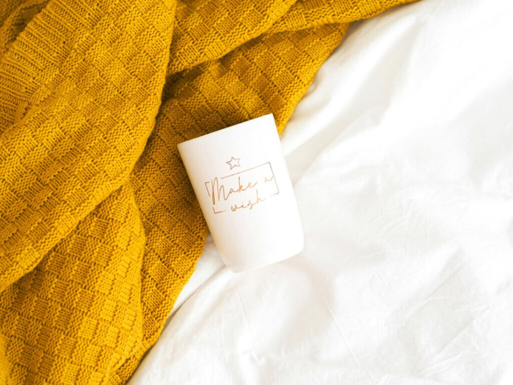
It’s as if late summer will never end: “Honey Glow”, a shimmering golden hue between amber, saffron and liquid honey, is bringing back the sensual warmth that many interiors have lacked in recent years. After an era of cool gray, muted blue and neutral white, the design world is longing for security, optimism and natural vibrations. Honey Glow fulfills all that – and more.
Honey Glow – between sun, earth and gold
The shade oscillates between sun-drenched wheat field and caramelized pear, it is warmer than ochre, less garish than yellow and softer than gold. There is something calming, almost archaic, in its depth. Color experts consider it to be one of the most important interior colors of 2025, as it symbolizes “familiarity, stability and a return to analogue”, according to the analysis. In times of digital overstimulation, Honey Glow is intended to make the home a haven of peace again – a place of retreat that is emotionally grounding.
How Honey Glow changes rooms
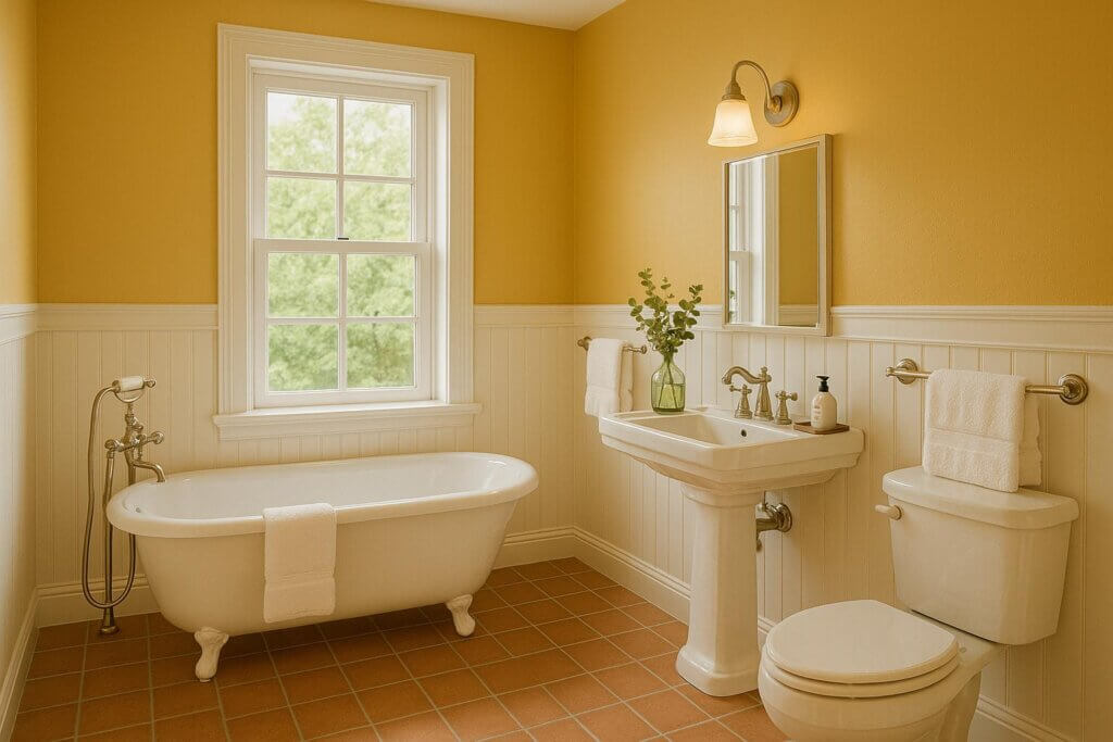
Honey Glow is surprisingly versatile in terms of its spatial effect. In living and dining areas, it creates a soft, unifying warmth that encourages conversation and absorbs light without darkening. In bedrooms, the tone has a calming effect, especially in combination with linen, clay or untreated wood. In bathrooms, it creates an almost spa-like atmosphere, especially in combination with natural stone, brass or cream-colored marble.
The Global Aesthetic Survey 2024 revealed that 73 percent of respondents long for “warmth and naturalness in their own four walls” – a direct counter-movement to the minimalist, cool interiors of the last decade. Honey Glow hits this nerve precisely.
Perfect partner colors
Honey Glow looks best in the company of muted green, which is reminiscent of olive leaves, or smoky blue, which adds depth. Terracotta, ecru and black-brown are also harmonious companions. Designers such as Ilse Crawford and Patricia Urquiola use the shade specifically as the “emotional center” of rooms – for example in carpets, wall panels or velvet-covered sofas that almost magically attract the eye.
In the kitchen, honey glow is experiencing a renaissance in ceramic fronts and tiles, combined with worktops made of light-colored limestone or marble. In living rooms, it can be seen on textiles – corduroy, bouclé, velvet – and in accessories such as lampshades, vases and frames. The major paint manufacturers are following this trend: Farrow & Ball calls its variant “India Yellow”, Dulux has “Golden Hour” in its range, and Caparol speaks of a “tone between beeswax and morning light”.
Materials with character
Honey Glow loves naturalness. Clay plaster, oak wood, rattan, bamboo or brass accentuate its depth, while matt surfaces make it appear velvety. Glossy lacquers, on the other hand, enhance its golden luminosity – perfect for small rooms where you want to reflect light.
Sustainability also plays a role: colors such as Honey Glow look particularly authentic when they are made with mineral pigments or vegetable oils. Brands such as Little Greene and AURO rely on ecological formulas that are not only health-friendly but also aesthetically timeless.
Honey Glow – more than just color
Honey Glow is an expression of a new attitude to living. It stands for the need for durability, for trust in natural materials, for the awareness that beauty and well-being are closely linked. Perhaps this explains why the tone is also finding its way into the fashion and product world: in cashmere sweaters, leather accessories or glass vases that capture the light like honey.
Related posts:
Color psychology in the living room: colors for more well-being
Wall paint basics: Which colors suit your home?
The Life of a Showgirl – Taylor Swift sets the interior trend


