
Colors are far more than just a design element – they influence our mood, our behavior and even our performance. Astrid Reintjes, founder of “Miss Pompadour”, an online store for colors based in Regensburg, Germany, has worked intensively on the effect of color tones in interiors. In this interview, she explains how color psychology works, which colors are suitable for different rooms and why the right choice of color can noticeably improve our quality of life.
Ms. Reintjes, what is actually meant by color psychology?
Color psychology deals with the question of how colors influence our emotions, our perception and our behavior. It is used specifically in areas such as marketing, design, art, fashion and even in psychotherapy to evoke moods or create desired reactions.
Is there any scientific evidence about how colors influence our well-being?
Yes, numerous studies have shown that colors have a measurable influence on our emotions, our well-being and even our behavior. Both cultural and individual factors play a role here.
Can the perception of color be generalized, or are there big differences in perception?
Colors do not have the same effect on everyone. Cultural differences are particularly noticeable. While white stands for purity and innocence in Western cultures, it often symbolizes mourning in Asian countries. Red, on the other hand, is associated with happiness and prosperity in China, while in Western countries it often stands for warning or passion. Individual feelings also play a role. Depending on our situation in life, we tend to be attracted or repelled by certain colors.
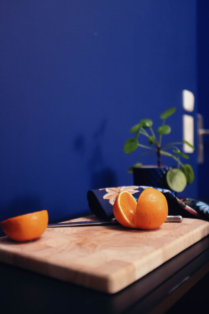
Let’s go through color by color: Red is associated with passion, but also with aggression. Does red fit in every room?
Red is a very powerful color and should be used with caution. I would advise against using it in the bedroom in particular, as red has a stimulating effect and creates the exact opposite of what you want to achieve in a room of relaxation.
Blue is considered calming, but can also be associated with melancholy. For which rooms is blue particularly suitable?
Blue is ideal for rooms where a relaxed atmosphere is desired. It fits particularly well in a bedroom or hobby room. Shades of blue with green are also ideal for bathrooms, as they create a connection to the theme of water and wellness.
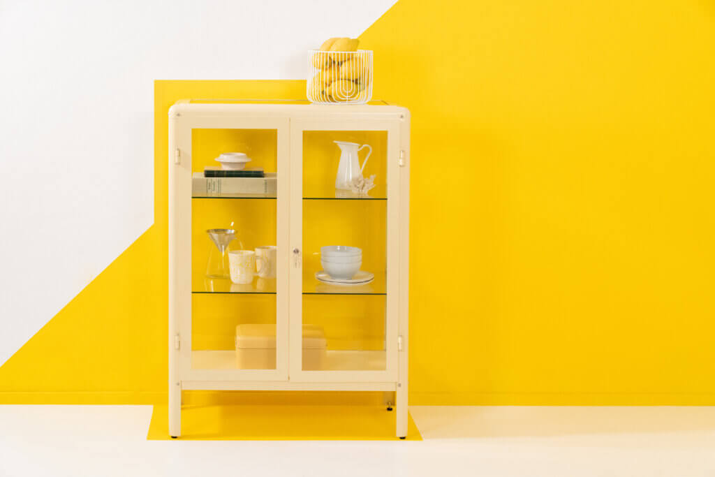
On the one hand, yellow stands for creativity and cheerfulness, on the other for cowardice and envy. How should yellow be used in interior design?
I don’t see the negative associations with yellow as strong. Rather, yellow encourages creativity, which is why it is particularly suitable for studies and home office areas. A little self-test: If you’re sitting in front of a blank sheet of paper and don’t know what to do, look at a yellow Post-It for two minutes. There’s a good chance that the ideas will start flowing.
What psychological effects does green have and how can it be used in a targeted way?
Green is associated with nature and health and is therefore an ideal kitchen color. It is also one of the most harmonious colors in interiors, as it goes well with almost all other shades. Especially in living rooms with large window fronts or in conservatories, green blends in harmoniously as it combines with the colors of nature outside.
Which colors make rooms appear larger or smaller?
The perception of a room depends on various factors, including the ceiling height, the direction of the sky and the floor plan. A light-colored ceiling visually enlarges low rooms, while a darker end wall provides more structure in a long hallway. A darker side wall can visually widen narrow rooms and give them more depth.
Contrary to popular belief, why can a dark color scheme create an open effect?
It is a widespread misconception that dark colors generally make rooms appear smaller. In fact, the pupil contracts when looking at a very light color, making the room appear narrower. Dark colors, on the other hand, cause the pupil to dilate, making the room appear larger.
Which colors are particularly suitable for bedrooms, dining rooms and the like?
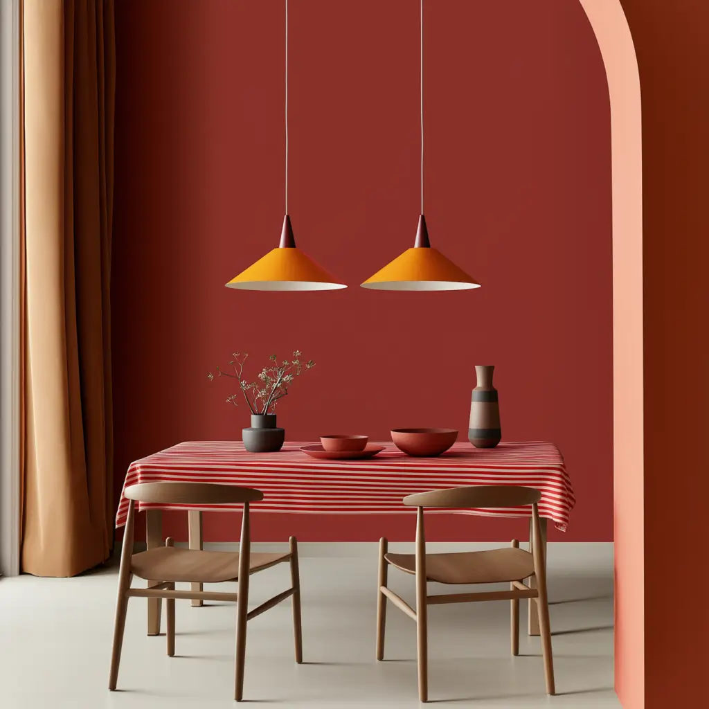
Shades of blue with gray are suitable for the bedroom as they have a calming effect. Alternatively, a warm beige is a good choice, as it has an enveloping and cozy effect. Orange tones are a good choice for the dining room, as they stimulate the appetite and encourage communication at the same time. Yellow tones are particularly suitable for the study as they stimulate creativity. In the bathroom, aqua tones, a mixture of blue and green, are an excellent choice as they create a fresh and relaxing atmosphere.
Why is it important in color psychology that colors match the personality of the residents?
Colors have a significant influence on our emotions, which is already evident in our daily choice of clothes. There are even scientific findings on this. Patients in sage-green hospital rooms recover faster, and recovery rooms in blue help to reduce panic. Inmates in prisons are also less aggressive when the walls are painted pink. So colors have a measurable effect, which is why you should carefully consider which shades best suit the residents and their current life situation.
What role do color combinations play and how can different tones be harmoniously combined?
Colors not only work individually, but also in combination with each other. Monochrome color worlds, i.e. different shades of one color, have a calming, elegant and minimalist effect. Analogous combinations, i.e. colors that lie next to each other on the color wheel, such as green and brown, create a natural and harmonious effect. Complementary colors that are opposite each other on the color wheel, such as blue and orange, have a dynamic and energetic effect. This combination is particularly suitable for creative rooms or business premises. Triadic combinations in which three colors are evenly distributed in the color wheel, such as red, blue and green, are very expressive and should be used deliberately and consciously in interiors.
Astrid Reintjes is co-founder and Managing Director of “Miss Pompadour”. The mother of four is responsible for production, logistics, purchasing and product development at the company, which was founded in 2019.
Photos: MissPompadour or MissPompadour/deense_zomer
Related posts:
Natural wall paints for your home


